Theming
TWD allows you to customize the appearance of the test sidebar to match your preferences or your application's design system. You can personalize colors, spacing, typography, and more through a simple theme configuration.
Overview
TWD uses CSS variables for theming, which means you can customize the entire UI without modifying any source code. The theme system is designed to be:
- Non-intrusive: Uses CSS variables that won't conflict with your application
- Flexible: Override any or all theme properties
- Type-safe: Full TypeScript support with autocomplete
Basic Usage
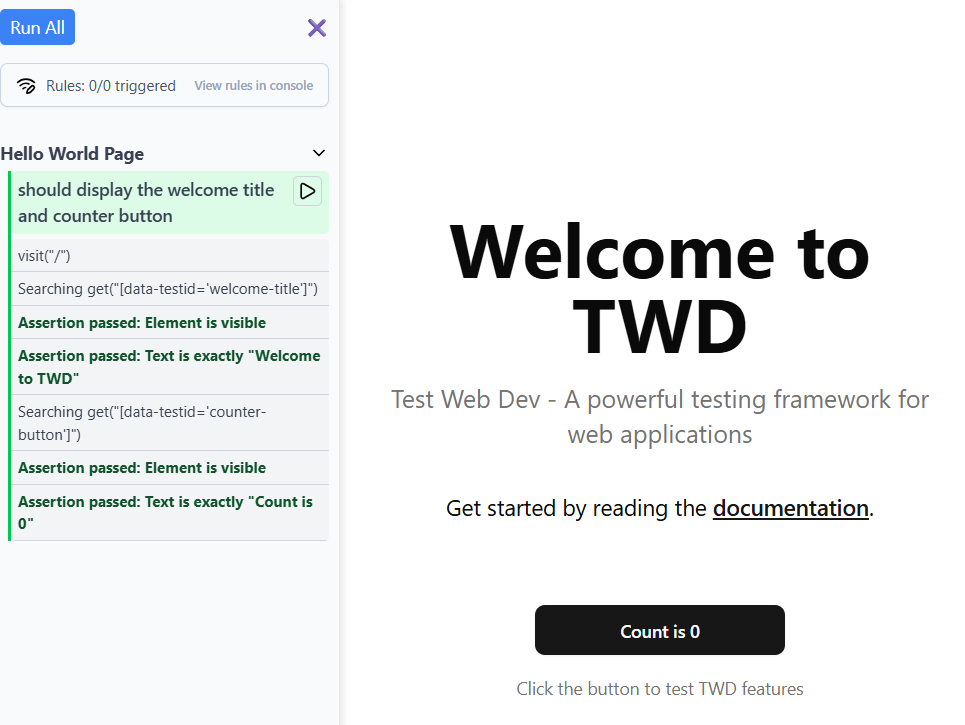
Here's a quick preview of the default theme:
With the twd() Vite plugin, pass a theme option in your vite.config.ts:
// vite.config.ts
import { defineConfig } from 'vite';
import react from '@vitejs/plugin-react';
import { twd } from 'twd-js/vite-plugin';

const customTheme = {
  primary: '#2563eb',
  background: '#ffffff',
  // ... more theme properties
};

export default defineConfig({
  plugins: [
    react(),
    twd({
      open: true,
      theme: customTheme,
    }),
  ],
});
Theme Properties
The theme object accepts the following properties (all optional):
Colors
| Property | Description | Default |
|---|---|---|
primary | Primary brand color | #1A6EF4 |
background | Main sidebar background | #f9fafb |
backgroundSecondary | Secondary background areas | #f3f4f6 |
border | Border color | #e5e7eb |
borderLight | Lighter border color | #d1d5db |
text | Primary text color | #374151 |
textSecondary | Secondary text color | #6b7280 |
textMuted | Muted text color | #475569 |
Describe Blocks
| Property | Description | Default |
|---|---|---|
describeBg | Background for describe/suite blocks | #0f172a |
describeText | Text color for describe/suite headers | #94a3b8 |
describeBorder | Left border accent for describe blocks | #334155 |
Status Colors
| Property | Description | Default |
|---|---|---|
success | Color for passed tests | #00c951 |
successBg | Background for passed tests | #dcfce7 |
error | Color for failed tests | #fb2c36 |
errorBg | Background for failed tests | #fee2e2 |
warning | Color for running tests | #fef9c3 |
warningBg | Background for running tests | #fef9c3 |
skip | Color for skipped tests | #f3f4f6 |
skipBg | Background for skipped tests | #f3f4f6 |
Interactive Elements
| Property | Description | Default |
|---|---|---|
buttonPrimary | Primary button background | #1A6EF4 |
buttonPrimaryText | Primary button text | #ffffff |
buttonSecondary | Secondary button background | #f8fafc |
buttonSecondaryText | Secondary button text | #475569 |
buttonBorder | Button border color | #cbd5e1 |
Spacing
| Property | Description | Default |
|---|---|---|
spacingXs | Extra small spacing | 4px |
spacingSm | Small spacing | 6px |
spacingMd | Medium spacing | 8px |
spacingLg | Large spacing | 12px |
spacingXl | Extra large spacing | 14px |
Typography
| Property | Description | Default |
|---|---|---|
fontSizeXs | Extra small font size | 10px |
fontSizeSm | Small font size | 12px |
fontSizeMd | Medium font size | 14px |
fontSizeLg | Large font size | 16px |
fontWeightNormal | Normal font weight | 400 |
fontWeightMedium | Medium font weight | 500 |
fontWeightBold | Bold font weight | 700 |
Layout
| Property | Description | Default |
|---|---|---|
sidebarWidth | Sidebar width | 280px |
borderRadius | Border radius | 4px |
borderRadiusLg | Large border radius | 6px |
Effects
| Property | Description | Default |
|---|---|---|
shadow | Main shadow | 2px 0 6px rgba(0,0,0,0.1) |
shadowSm | Small shadow | 0 1px 2px rgba(0, 0, 0, 0.05) |
Other
| Property | Description | Default |
|---|---|---|
zIndexSidebar | Sidebar z-index | 1000 |
zIndexSticky | Sticky header z-index | 1000 |
animationDuration | Animation duration | 0.2s |
iconColor | Icon color | #000000 |
iconColorSecondary | Secondary icon color | #364153 |
Example Themes
Dark Theme
A complete dark theme for those who prefer dark mode:
// vite.config.ts
import { defineConfig } from 'vite';
import { twd } from 'twd-js/vite-plugin';

const darkTheme = {
  primary: '#2dd4bf',
  buttonPrimary: '#2dd4bf',
  buttonPrimaryText: '#042f2e',
  background: '#0b0f14',
  backgroundSecondary: '#111827',
  skipBg: '#111827',
  border: 'rgba(255, 255, 255, 0.08)',
  borderLight: 'rgba(255, 255, 255, 0.12)',
  buttonBorder: 'rgba(255, 255, 255, 0.12)',
  text: '#e5e7eb',
  textSecondary: '#9ca3af',
  textMuted: '#6b7280',
  describeBg: '#0f172a',
  describeText: '#94a3b8',
  describeBorder: '#334155',
  success: '#22c55e',
  successBg: 'rgba(34, 197, 94, 0.15)',
  error: '#f87171',
  errorBg: 'rgba(248, 113, 113, 0.15)',
  warning: '#facc15',
  warningBg: 'rgba(250, 204, 21, 0.15)',
  skip: '#6b7280',
  buttonSecondary: '#111827',
  buttonSecondaryText: '#e5e7eb',
  sidebarWidth: '320px',
  borderRadius: '10px',
  shadow: '0 0 0 1px rgba(255,255,255,0.05), 0 8px 24px rgba(0,0,0,0.6)',
  shadowSm: '0 1px 2px rgba(0,0,0,0.4)',
  iconColor: '#e5e7eb',
  iconColorSecondary: '#9ca3af',
};

export default defineConfig({
  plugins: [twd({ open: true, theme: darkTheme })],
});
Minimal Theme
A clean, minimal theme with subtle colors and increased spacing:
// vite.config.ts
import { defineConfig } from 'vite';
import { twd } from 'twd-js/vite-plugin';

const minimalTheme = {
  primary: '#6366f1',
  background: '#ffffff',
  backgroundSecondary: '#f8fafc',
  border: '#e2e8f0',
  borderLight: '#cbd5e1',
  text: '#1e293b',
  textSecondary: '#64748b',
  textMuted: '#94a3b8',
  describeBg: '#f8fafc',
  describeText: '#64748b',
  describeBorder: '#cbd5e1',
  success: '#10b981',
  successBg: '#ecfdf5',
  error: '#f43f5e',
  errorBg: '#fff1f2',
  warning: '#f59e0b',
  warningBg: '#fffbeb',
  skip: '#f1f5f9',
  skipBg: '#f8fafc',
  buttonPrimary: '#6366f1',
  buttonPrimaryText: '#ffffff',
  buttonSecondary: '#f1f5f9',
  buttonSecondaryText: '#475569',
  buttonBorder: '#e2e8f0',
  spacingXs: '6px',
  spacingSm: '8px',
  spacingMd: '12px',
  spacingLg: '16px',
  spacingXl: '20px',
  sidebarWidth: '300px',
  borderRadius: '12px',
  borderRadiusLg: '16px',
  shadow: '0 4px 6px -1px rgba(0, 0, 0, 0.1)',
  shadowSm: '0 1px 2px 0 rgba(0, 0, 0, 0.05)',
};

export default defineConfig({
  plugins: [twd({ open: true, theme: minimalTheme })],
});
CSS Variable Override
Alternatively, you can override theme variables directly in your CSS without using the JavaScript API. This is useful if you want to use CSS preprocessors or keep all styling in CSS files:
/* In your global CSS file */
:root {
  --twd-primary: #2563eb;
  --twd-background: #1e293b;
  --twd-text: #f1f5f9;
  --twd-success: #22c55e;
  --twd-error: #ff5252;
  --twd-background-secondary: #182130;
  --twd-describe-bg: #0f172a;
  --twd-describe-text: #94a3b8;
  --twd-describe-border: #334155;
  /* ... other variables */
}
All theme properties are automatically converted to CSS variables with the --twd- prefix. For example:
primary→--twd-primarybackgroundSecondary→--twd-background-secondarybuttonPrimary→--twd-button-primary
TypeScript Support
For full TypeScript support and autocomplete, import the TWDTheme type:
import type { TWDTheme } from 'twd-js/bundled';

const myTheme: Partial<TWDTheme> = {
  primary: '#2563eb',
  background: '#ffffff',
  // TypeScript will autocomplete all available properties
};
Best Practices
- Start with defaults: Only override the properties you need to change
- Maintain contrast: Ensure text colors have sufficient contrast against backgrounds for accessibility
- Test status colors: Make sure success, error, and warning colors are clearly distinguishable
- Consistent spacing: Use the spacing scale consistently throughout your theme
- Consider dark mode: If your app supports dark mode, create a matching dark theme for TWD
Complete Example
Here's a complete example combining theme customization with other options:
// vite.config.ts
import { defineConfig } from 'vite';
import react from '@vitejs/plugin-react';
import { twd } from 'twd-js/vite-plugin';

export default defineConfig({
  plugins: [
    react(),
    twd({
      open: true,
      position: 'right',
      search: true,
      serviceWorker: true,
      serviceWorkerUrl: '/mock-sw.js',
      theme: {
        primary: '#8b5cf6',
        background: '#faf5ff',
        text: '#4c1d95',
        sidebarWidth: '320px',
        borderRadius: '8px',
      },
    }),
  ],
});